TL;DR: FB Instant Article style stretchy images, in Cordova.
The experiment
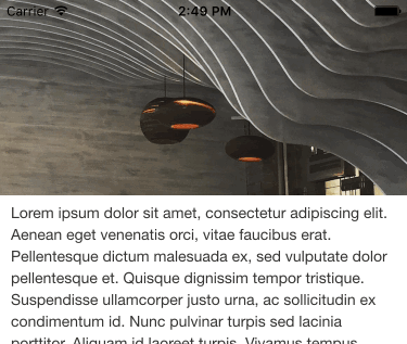
I love this effect I've being seeing in iPhone apps recently. Not sure what it's called, but I believe it has something to do with Xcode's Auto Layout feature. You know, it's the stretchy image at the top of Facebook's Instant Articles pages.

The prevailing feature of these images, is how they react to momentum scrolling. As you pull down the page down (putting the page in a negative scroll position), the header image stretches to accommodate the additional space. The image maintains aspect ratio as the image stretches, creating a zoom effect.
NOTE: Momentum scrolling is essentially the ability to over scroll your view.
This post is a result of me wanting to recreate this effect in JavaScript, for use in Cordova apps. Long story short, I cracked it; with a couple of special considerations.
No feedback from 'over scroll'
As I'm sure you're aware, scrolling a HTML element triggers a scroll event, which happens for every change in position. Not so with momentum scrolling (or, over scroll). Let's clarify that. If you're already scrolling and you go into an over scroll, you will indeed generate scroll events, indicating negative scroll positions. However, there are two key scenarios that don't generate scroll events:
- If you motion directly into an over scroll. Your scroll position is zero and you attempt to scroll up (drag) the screen with your finger. This is not considered a scroll action and does not generate a scroll event.
- If you release your finger during an over scroll, the resulting elastic 'snap back' will not generate any scroll events.
Furthermore, I suspect the snap back animation hides the true position of the content (until complete), as I've not managed to track the animation using timers. I've not tried requestAnimationFrame in a loop, but I'm not optimistic.
Cordova only?
For the sake of speed, I did my initial tests in Safari mobile, rather than a Cordova container. There are also some advantages, debugging wise, working directly in Safari. It stuck me that this experiment could have applications beyond Cordova; Safari web applications for instance. Alas not, I was getting some weird results that weren't making much sense at first.
The unexpected results, were due to the window's over scroll. Within a HTML page, you have to explicitly set which elements you'd like to over scroll, by adding -webkit-overflow-scrolling: touch; to the CSS of your scrollable element. Unfortunately for Safari Mobile, and by extension Safari web applications, the whole window over scrolls by default.
NOTE: The same happens in a Cordova container, but can be disabled using the DisallowOverscroll preference.
This effectively nullifies any attempt to over scroll a HTML element from a zero position. Attempting to over scroll an element, that is at a starting position of 0px, results in an over scroll of the whole window.
I feel like this is still something that can work outside of Cordova, which I will pursue at a later date.
The implementation
Brace yourself. My implementation exists in a MVC structure, using Babel and Sass. The outcome relies heavily on jQuery, I imagine there would be small gains to be had, by removing it.
HTML
For the HTML, I placed the header image outside the scrollable container. Feels like a cheat, but I've stuck in an empty div (div.content-spacer) above the actual content, the reason for this will become clear when I discuss the CSS.
<div class="image-stretch"></div>
<div class="scroll-parent">
    <div class="content-spacer"></div>
    <div class="content-area">
        <p>
            Lorem ipsum...
        </p>
    </div>
</div>
CSS
The image itself is absolutely positioned behind the scrollable content. I have an empty div (div.content-spacer) above the content, to ensure the image is visible.
The space provided by the empty div, is 20px shy of the size of the image. This provides a buffer for the over scroll animation, which I like. It's not necessary for the effect to work though.
.smooth-operator is a class that allows the conditionally application of transition effects, basically to track the snap back animation by using a similar transition duration.
.image-stretch {
    background-image: url('../images/stretch.jpg');
    background-position: 50% 50%;
    background-size: cover;
    height: 200px;

    position: absolute;
    left: 0;
    top: 0;
    width: 100%;
}

.smooth-operator {
    transition-duration: 250ms;
    transition-property: height;
}

.content-spacer {
    height: 180px;
}

.content-area {
    background: #fff;
    padding: 6px 10px;
}
JavaScript
I wanted the script to react to every pixel movement, without having to deal with same pixel twice. _scrollTop ensures this, by acting as the script's 'debounce'.
Parallax Rollup
The finished script deals with two effects; the over scroll stretch, and a slight parallax rollup (as the image disappears off the screen). I want to talk about the parallax effect first, because while it wasn't the point of the experiment, I think it adds a nice bit of fluidity to the scroll. The effect comes at a price though.
As you scroll down the content (moving your finger up), the image tracks the content at a quarter speed of the scroll, see:
$imageStretch
    .css('transform', `translateY(-${scrollTop / 4}px)`);
I think it looks great, so I've kept it. But the cost is, if you momentum scroll back to the top of the page, the content will hit the zero position before the image realises what is going on (no scroll event). So, there is a slight jump as the image realigns itself (as the result of a touchend event).
else if (scrollTop === 0 || scrollTop >= imageHeight) {
    $imageStretch
        .css('transform', `translateY(0px)`);
}
To try and cheat the imbalance, the script above resets the Y position of the image to 0px, the moment the image is out of view. Meaning that the image is already in it's starting position, should the user surprise us with a momentum scroll. The slight jump can still be seen if you momentum scroll with the image only half visible. I just saying, you could make the overall user experience more cohesive, by not tracking the content scroll at all.
Stretchy image zoom
The main attraction is the stretchy image zoom. As the finger pulls the view into over scroll, the image stretches to compensate. During the stretch, CSS transitions are disabled, which are then enabled during the snapback. The 250ms transition duration has worked quite well for me in tests.
const imageHeight = 200;
let _scrollTop;

$('.image-stretch')
    .on('webkitTransitionEnd transitionend', function() {
        $(this)
            .removeClass('smooth-operator');
    });

$('.scroll-parent')
    .on('scroll', function() {
        const scrollTop = $(this).scrollTop();

        if (_scrollTop === scrollTop) {
            return;
        }

        _scrollTop = scrollTop;

        const $imageStretch = $('.image-stretch');

        if (scrollTop <= 0) {
            $imageStretch
                .height(imageHeight + Math.abs(scrollTop));

            if (scrollTop === 0) {
                $imageStretch
                    .css('transform', `translateY(0px)`);
            }
        }
        else if (scrollTop > 0 && scrollTop <= imageHeight) {
            $imageStretch
                .css('transform', `translateY(-${scrollTop / 4}px)`);
        }
        else {
            $imageStretch
                .css('transform', `translateY(0px)`);
        }
    })
    .on('touchend', function() {
        const scrollTop = $(this).scrollTop(),
            $imageStretch = $('.image-stretch');

        if (scrollTop < 0) {
            $imageStretch
                .addClass('smooth-operator');

            $imageStretch
                .height(imageHeight);
        }
        else if (scrollTop === 0 || scrollTop >= imageHeight) {
            $imageStretch
                .css('transform', `translateY(0px)`);
        }
    });
The result

You can see the code here. To run it yourself, ensure you have Gulp and Cordova installed globally (npm i -g cordova gulp).
Run gulp build from the project root, and cordova build ios for the cordova directory. From there, you can run the project in Xcode. I will get around to creating a README, promise.
The test project was built using a yo generator I'm working on, called ml. Which is based on an MVC app framework I'm working on, called middle-layer.